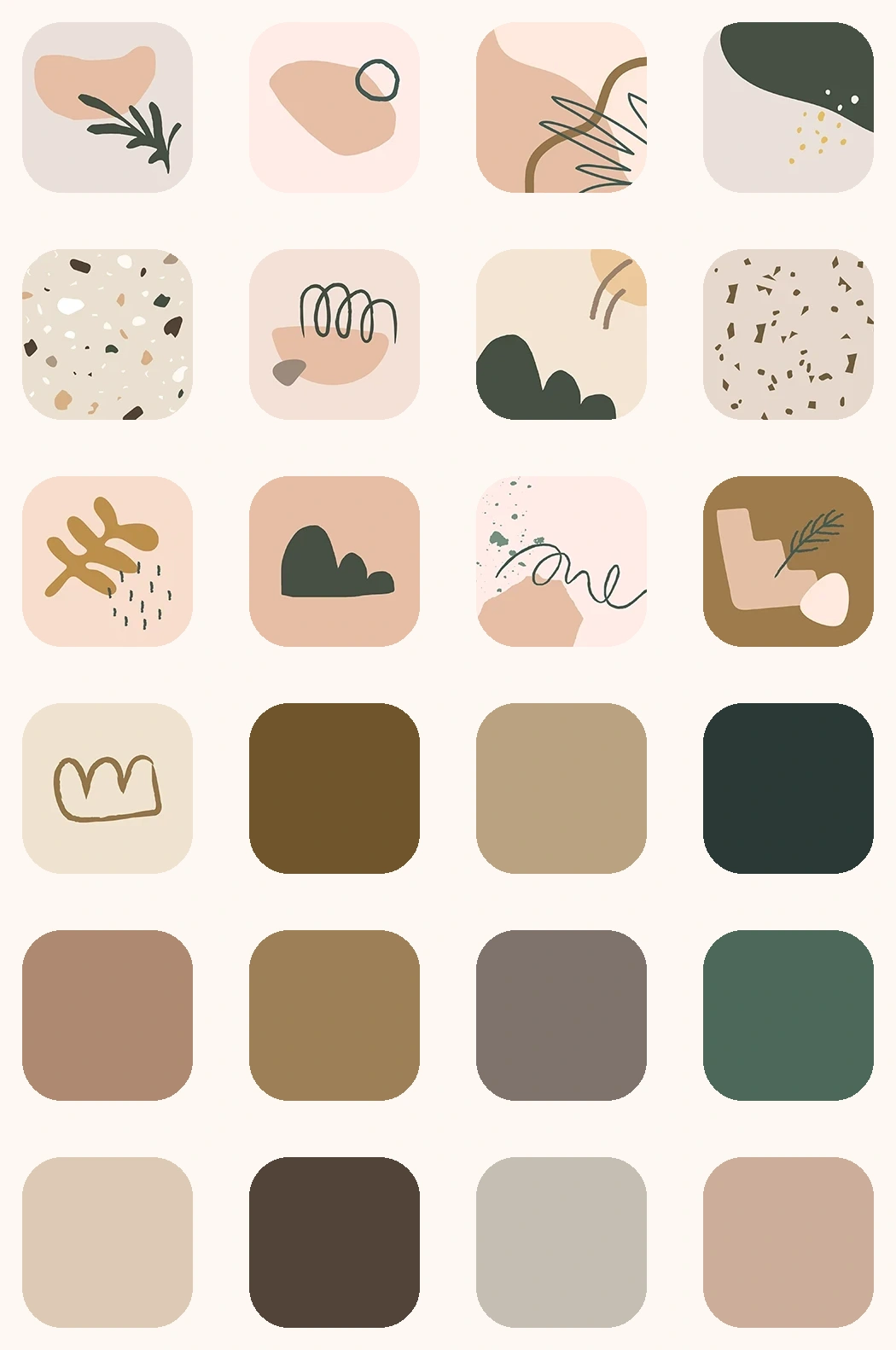
A drop of sensibility on water color
Explore A drop of sensibility on water color, a consistent app icon style for your iPhone Home Screen. Preview the look and use it in PhotoWidget for making app shortcuts feel visually aligned with your wallpaper and widgets.

Quick answer
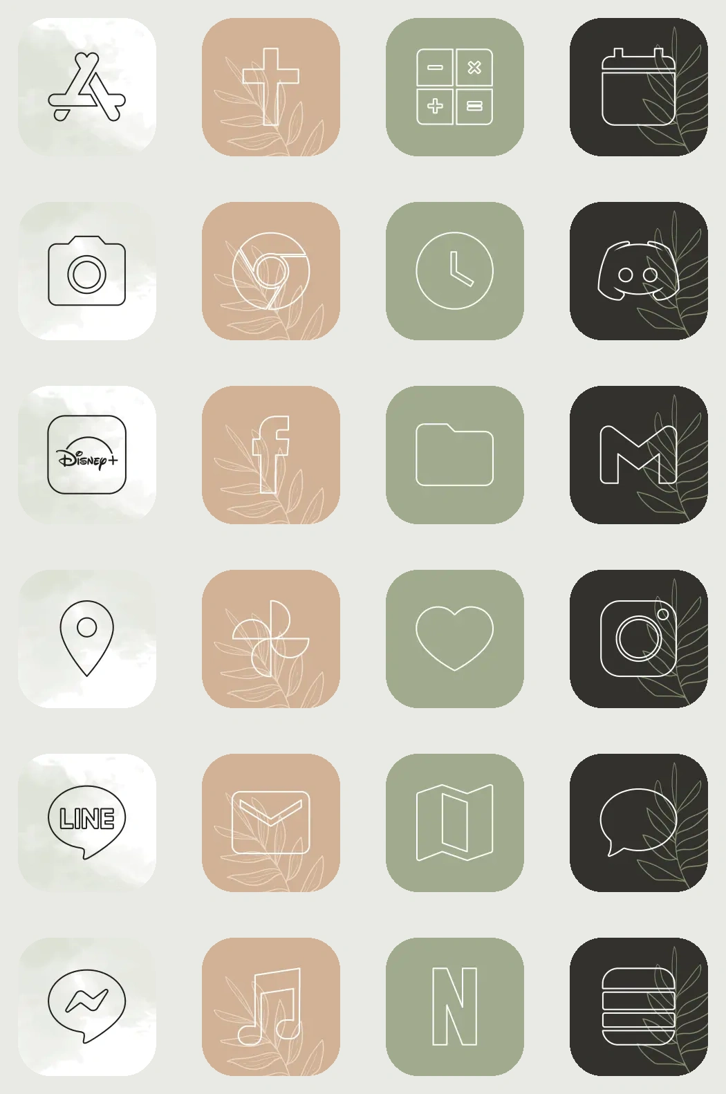
A drop of sensibility on water color is a PhotoWidget icon set for making app shortcuts feel visually aligned with your wallpaper and widgets. Use it when you want a consistent app icon style for your iPhone Home Screen and a Home Screen setup that feels intentional without building every piece from scratch.
What is A drop of sensibility on water color?
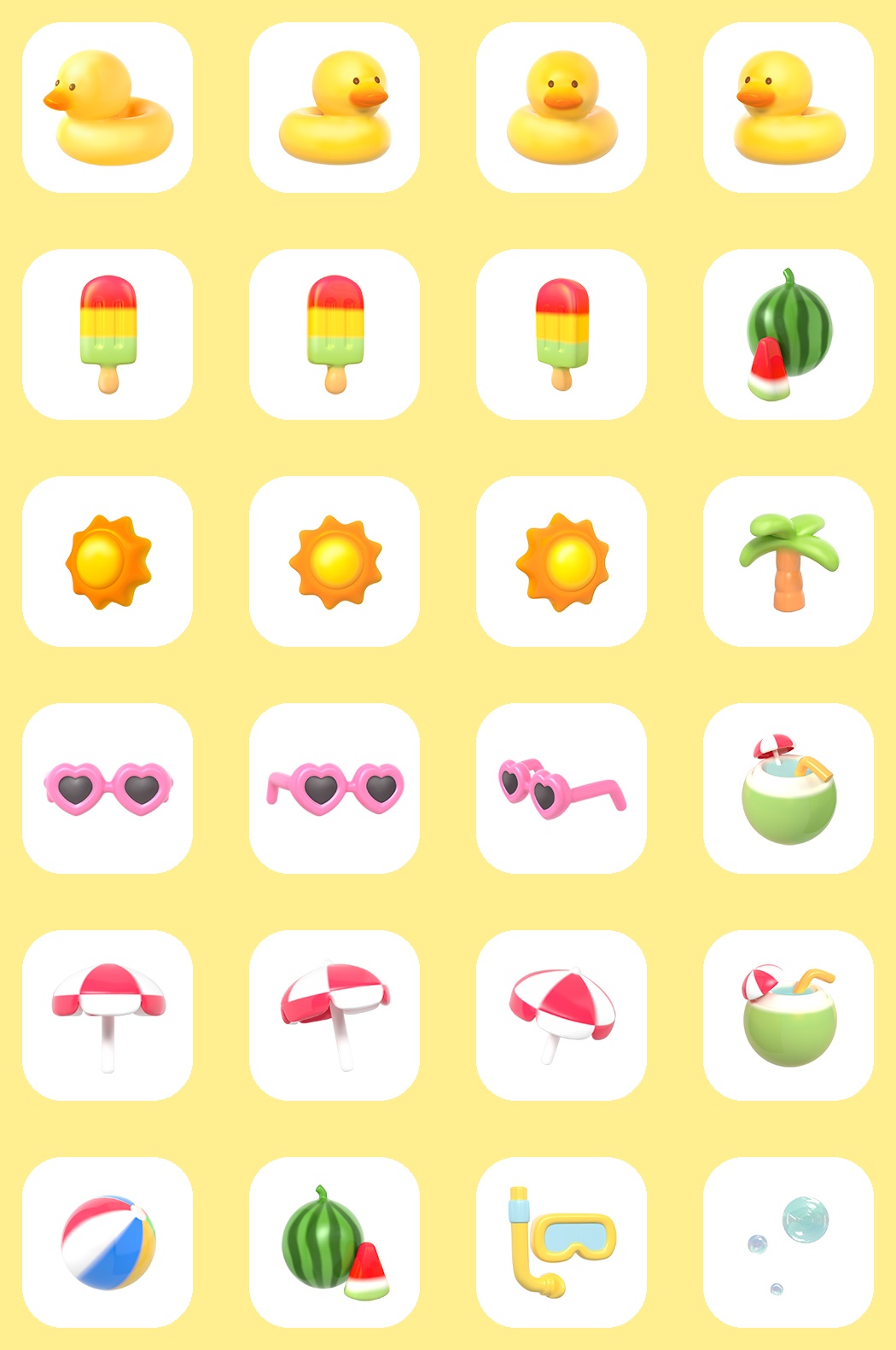
A drop of sensibility on water color is a consistent app icon style for your iPhone Home Screen. It gives your iPhone setup a clear visual direction, so the screen feels coordinated before you add personal photos, daily information, or app shortcuts.
Best use cases
How to apply A drop of sensibility on water color
What to match with it
Pair A drop of sensibility on water color with wallpapers, widgets, themes, lock screen styles. Repeat one or two colors from the design, then choose widgets and icons with a similar contrast level. This keeps the setup cohesive while still leaving room for personal photos and useful information.
Styling checklist
Related search intents
Explore what matches this icon set
Use this icon set as the starting point, then browse nearby PhotoWidget sections to build a more complete iPhone setup.